A lot of people don't like the changes :( I don't like how much empty space there is. Is it for mobile users?
I don't think there is any way to change it back, sadly.
In the top right of pictures in game store pages you can expand/contract the view. But that probably wasn't what you needed.
Comment has been collapsed.
They have an app for mobile users.
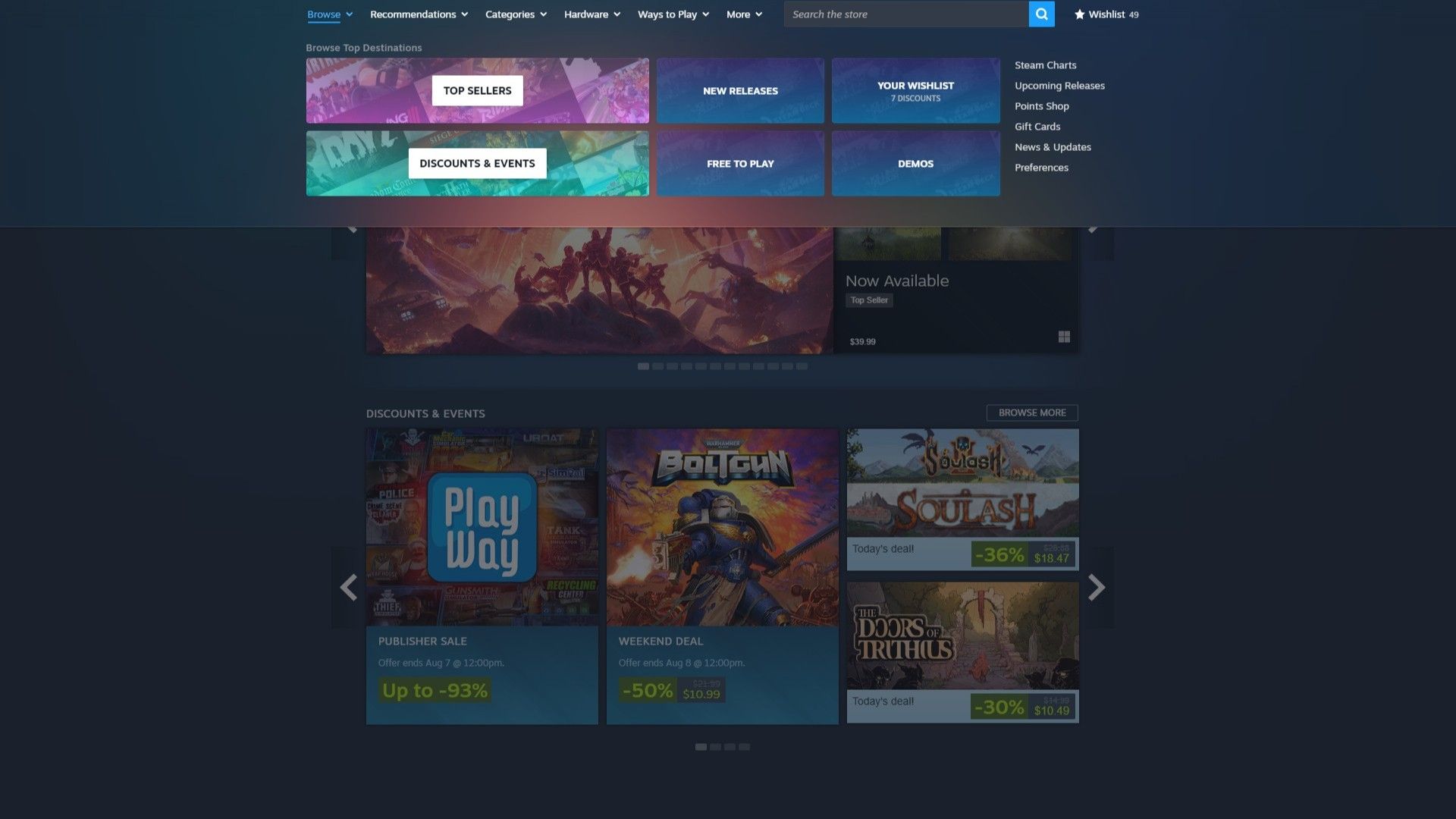
Now there are menus you have to click on to get them to drop down, instead of hover-to-drop the way those menus used to be.
In the interest of cleanness, they have hidden essential links behind and inside such menus, or even removed some links entirely.
I want the sidebar returned. I don't care if it is "uniformity with how the deck shows the store." I neither have nor want a deck, and don't care if steam has to spend a few more dollars to have it look different on different platforms.
I zoom out to 80% anyway; i may change my zoom even more. The ocean of blue space is not desired.
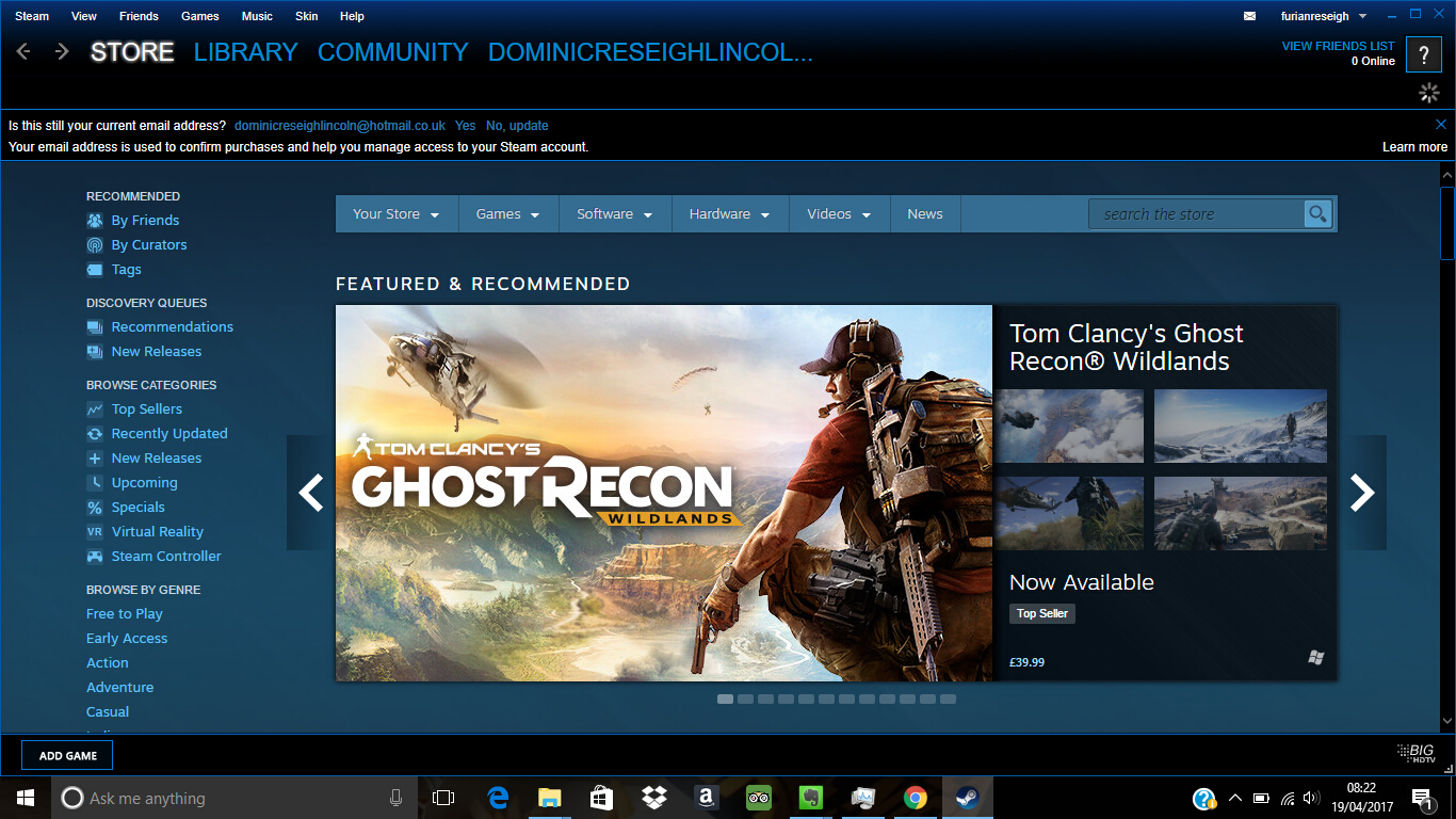
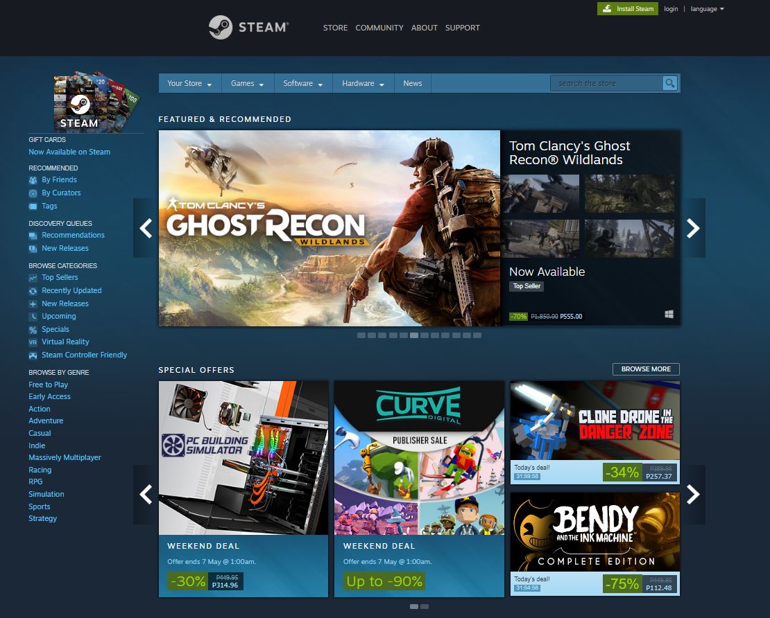
The old store page looked like pictures 1 & 2, for those who are wondering:
Now it looks like Picture 3 (or this link https://gamerant.com/steam-store-menu-change-beta-update-july-2025/ )
Comment has been collapsed.
I wouldn't mind the larger pictures, if the rest of the store would finally also use the entire screen.
Right now 2/3 are just empty space and you have to scroll quite far to get to the 'New & Trending' etc section.
Plus, with the top bar replacing the side thingy, many things require an extra click now, it's just pure enshittification.
Comment has been collapsed.
I honestly can't see what the changes actually are. But then I use a 4:3 monitor (so maybe the changes can only be seen on a widescreen) and I think the store's homepage has been a cluttered mess for quite a few years for now, so it's gonna be pretty hard for Valve to do worse.
Comment has been collapsed.
no changes here on my locked in stable windows 7 steam
happy to not have all the new bugs
like broken auto correct, mine works
Comment has been collapsed.
curious question, does it fully work, with things like login and downloading games?
I remember reading that older version of steam client compatible with win7 didn't have zstd compression implemented (added in later version), which I believe is now used by the client.
Comment has been collapsed.
everything works
until steam just recently fucked us by changing one tiny thing on the way they send out downloads without giving us a patch https://steamcommunity.com/groups/Windows7ForeverUpdateNever/discussions/0/600783421635054671/
a few workarounds but you need to do it every game
not for all games but some
reported this to some game devs and a few of them went back to the old download system so i can still normally update
Comment has been collapsed.
Banners display proper at FHD.
Store page fills out the space at HD but the icons are too big at this resolution.
They screwed up with this one.
Anything larger than HD makes the store page feel empty on the sides, so the higher the resolution the more of an issue it becomes. Also higher resolution makes icons better as they become smaller. So you can't have the best of both worlds, unless there is a resolution in between that captures the best of both worlds.
I usually use the steam store windowed so it occupies about half the screen on my 1440p monitor, it works just fine that way looks wise, but i do not like the ease of access being removed from the sides. It becomes more complex to navigate for users that grew up with filters and quick options to the sides. They are simplifying the looks in hopes that new users get attached to the feed the store throws at them. This is what exists in consoles for the most part, they simplify by removing things, so people are more tempted to buy what you see instead of exploring.
Comment has been collapsed.
Might be time to update my old browser, but I'm lazy and don't like change, so I probably won't. All the text for the menus across the top of the page are piled over top of eachother and some are partially in the search box. Also, mousing over the rating no longer has a popup that shows the rating percentage. Other than that, I didn't notice any difference.
Comment has been collapsed.
The compact and smallness of how it was, made it much easier to scroll through new games
Yup, Youtube did the same not so long ago... Apparently the new trend these days is to make everything huge because frontend devs nowadays assume everyone uses a phone as opposed to a computer 🤷
Terrible indeed, but they call it "progress"
Comment has been collapsed.
Yeah, this is my understanding as well... Everything keeps being (re)designed to be aimed at phone viewing, meanwhile leaving the end results to look really ghastly on computers.
Comment has been collapsed.
That said, Mayo does have a good point, I'm not even sure the result is that nice on a phone... (and do people really browse Steam on a phone much? 🤔)
Comment has been collapsed.
No idea as I sure don't, but it would be interesting to see some statistics on the matter if it'd exist!
Comment has been collapsed.
For youtube you can use an add-on called "youtube row fixer" to configure the size and some other options of how things are displayed, it makes youtube usable on desktop again. But it's kind of unforgivable that these options aren't built into the site since they're pretty much necesary for the UI to look right.
Comment has been collapsed.
The idea of increasing most of UI's is mostly based in people with issues, be it from older people who have a harder time clicking somewhere, to people with vision impairment which have a harder time distinguish stuff.
While I personally also prefer a smaller setting and believe in allowing choice of size, that's the main reason most UI's have gotten bigger.
Comment has been collapsed.
I'm not convinced about that. In the case of YouTube for instance, they make the thumbnail huge but the text is still as small, and actually, not that easy to read on my screen 👀. My email provider has the same fault, they recently doubled the size of the toolbar, yet elements in it, particularly texts, are still the same size as before. Basically, they wasted space with void, for the sake of "beautifulness", or at least their very own vision of it.
If they care about accessibility for people with vision issues, they should instead focus on making sure their website responds well to the browser zooming in (+/- out). That said, they don't even really need to do that, as it's easy to just make everything bigger at the OS level, by playing with the display resolution and scaling, which makes the most sense for someone with vision issues, as you keep the harmony between all websites and software, by having everything zoomed similarly and at your best convenience.
Comment has been collapsed.
And the rest, what's not needed.. Whole blank field on the left.
Comment has been collapsed.
I'm surprised to hear that some people don't like it, but I might be biased because I'm a fan.
Only thing I want is to change the color of the main store page to orange or something, but overall I'm pretty happy.
Search bar shows recently viewed games? Yes please!
Category tab is v colorful, and I have a one click to see my favorite genres? Even easier to browse farming games.
Comment has been collapsed.
Same. Honestly didnt even notice things had changed.
Never was a fan on how the layout worked before.
IMO this is pretty much as always with change. People who actually use it often are simply used to the existing system and have biased view on change. Lets wait a several months, everyone will have forgotten how the old design worked and when a new iteration drops, the same people will defend this design... the endless circle of launching new designs.
Also dont see any grounds for criticizing "empty space" left in the site.. On a regular 16:10 laptop most of the screen has content. As a widescreen user myself, I dont see why they should optimized it for widescreen not to have most of the screen as blank space.
Comment has been collapsed.
Either it hasn't updated for me yet or I'm just failing to see what is it that got larger, all I noticed was the redesigned bar at the top and that one of the showcase displays (the one about recently updated games) has actually gotten way bigger, but the rest looks roughly the same to me.
Comment has been collapsed.
https://www.steamgifts.com/go/comment/lUtxQgW The first one how it is now. second is zoomed out.
Comment has been collapsed.
I haven't used the full search function in some time since it usually finds the game I'm looking for as the first or second suggested result so it's entirely possible that I'm just misremembering the scale of it and that's why I didn't notice any difference at a glance, if anything these changes seem rather minor when compared to the complete overhaul that the top bar went through which might also explain why that's the only thing that caught my eye.
Comment has been collapsed.
I overlapped the images and scaled the according to the sidebar. There's no difference in size of the images?
Comment has been collapsed.
Because those are the same after friday and after the changes.
Those pictures you see used to be a lot smaller, when you could see 20-30? games on 1 page at a time with a normal 100% zoom, now as you can see you can barely see 8. If you have a day with a lot of releases it's a lot to scroll through.
I can easily pin out games that would interest me often by just looking at it's picture, sometimes hover over it,
Comment has been collapsed.
So, one quick fix for wishlists not working is to change your default language, save, then change it back and save again. No idea why that works, but it works.
Comment has been collapsed.
why fix something that isn't broken?
I know you probably mean this rhetorically but...
Not sure. But marketing / sales groups seem to always like to for some reason... at least they did back when I worked as a web developer for a really big company. Also, managers giving people busy work or sometimes just bored developers.
is there any way to change it back?
If you are decent with javascript, you could maybe make a userscript or hope that someone else is as annoyed by it as you are (rare but sometimes it happens). Maybe an AI could do it if you are able to use developer tools to provide id's/classnames of elements on the page (in my experience, duck.ai isn't bad for privacy ... but ai also gets a LOT of things wrong so meh). Either way, the major downside of userscripts is that they tend to break if the page changes again
Outside of that, I kind of doubt steam will revert it unless it pisses off a lot of people, and maybe not even then.
Comment has been collapsed.
Steam Autumn Sale 2025
56 Comments - Last post 31 minutes ago by hbarkas
[Steam] Total War: Imperial Bundle(Empire+Napol...
26 Comments - Last post 50 minutes ago by hoanglinhtran196
[Humble Bundle] September 2025 Choice (#70) 🐶
243 Comments - Last post 1 hour ago by paco7533
【Steam】Autumn Sale 2025|9 Stickers Free until O...
15 Comments - Last post 2 hours ago by RobbyRatpoison
[FREE][STEAM][ALIENWAREARENA] Levelhead (T5)
3,424 Comments - Last post 3 hours ago by ColdOut
【Steam】Snake Eyes Dungeon|Free until Oct 3 17:0...
8 Comments - Last post 4 hours ago by Butterflysense
A list of games whose unredeemed keys were revo...
1,623 Comments - Last post 4 hours ago by krol7
October is a "play a game you won on Steamgifts...
21 Comments - Last post 11 minutes ago by DarkRainX
September is a "PAGYWOSG" month - Incredible Ch...
167 Comments - Last post 13 minutes ago by DarkRainX
Looking to whitelist people (but also more the ...
117 Comments - Last post 14 minutes ago by Dcook20
TGC SG Forum Giveaway, October Event Edition [E...
32 Comments - Last post 31 minutes ago by quinnix
Don't you want me? Don't you want me?
14 Comments - Last post 1 hour ago by NoYeti
[POLL] - MK Arcade Kollection (2012) vs. MK: Le...
5 Comments - Last post 1 hour ago by FluffyKittenChan
Don't like bots? Post your random invite-only g...
9,087 Comments - Last post 2 hours ago by hbarkas


I already noticed some changes, but today they are showing larger pictures of games (because why fix something that isn't broken?).
It's like having your browser on zoom x150.
The compact and smallness of how it was, made it much easier to scroll through new games, is there any way to change it back?
Comment has been collapsed.