Spec Ops: The Line - Before you can select anything on the main menu it has to sit there for a minute checking for updates. Why do you need to check for updates each run when Steam handles all the updates in the background?
Comment has been collapsed.
Shoppe Keep is a game I would have enjoyed if not for the absolutely horrible UX, in part because of bugs or bad design but a large part of it is the absolutely horrible UI.
There's good reason they only show a few screenshots that have any part of the UI on it, and even those don't show the full UI.So I put together a little album...
All the important things you do in this game is done in menus that are barely readable and really hard to get an overview over. while you're constantly bombarded with huge text showing things that should be hidden away on some statistics page. Font choices are terrible for legibility, and there is a total disregard for contrast making some menus pure horror to try and figure out. The "tutorial" is actually badly phrased text descriptions which gives some basic hints for how to play the game - so not a tutorial at all but just a help file.
Basically the things that are important doesn't stand out, and the things that stand out are not important. I could go on and on, I went on a long rant about it to my girlfriend after I got this game and tried playing it.
It's a real shame because I like this sort of game typically, and I could have enjoyed the game despite the bugs and annoyances in the gameplay if it wasn't for this horrible UI.
To improve the UI the developer simply has to conform to one rule - less is more. All menus should be easily integrated and when you go into the order sheet or something it should cover the entire screen, be easily readable and have lots of whitespace. Also keep all "strange" fonts to headlines and such, never use anything other than simple fonts for menus and choices and running text and so on. All text fields should have a standardized background with high contrast to the text to be easily readable.
Comment has been collapsed.
i play Shoppe Keep right now, i uninstalled it because of gui but i gave the game another chance
Comment has been collapsed.
Wow, just wow. I liked your little album and your text. It's hard to imagine anybody thought this game was ready for release.
Comment has been collapsed.
It's even worse than that. They've stopped working on the game and are getting ready to release the sequel. So not only did they think it was ready for release, they thought it was good enough to abandon to work on other things.
Comment has been collapsed.
Couldnt agree more.
I really wanted to play Shoppe Keep. Was pretty hyped, didnt know nothing about it, but seemed interesting.
I dont think i have played it more then 15 minutes. UI is just horrid.
Comment has been collapsed.
Valkyria Chronicles. The overview map's menu scheme is atrocious; it takes three times as many clicks to save or load than it ever should. In the story mode, the game asks at every single scene of every single chapter if you want to continue watching the story or not.
Great tactical game, dreadful UI.
Comment has been collapsed.
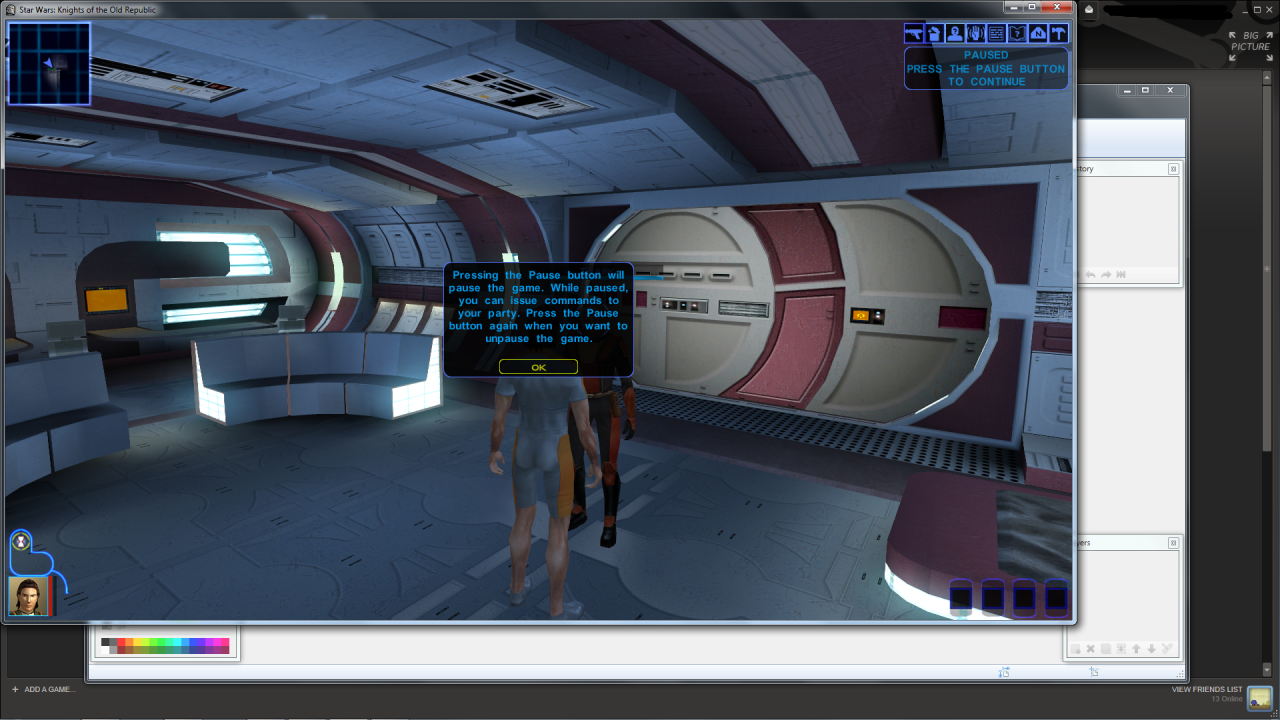
kotor 1 is just plain sad, it looks like an asset flip game.
unmodded oblivion was terrible, those huge menu items omg *facepalm*


Comment has been collapsed.
Never played kotor but this looks just terrible :(
Comment has been collapsed.
Because it's not how it looks. Mully screen is from some bad wide screen modded game. It should look like this:
Comment has been collapsed.
Yeah. But it's 14 y/o game, and this type of layout was pretty common back then. And is still common in few games genre - chracter portrait / quicklots at the bottom, quickmap and quest tracking at the top.
Comment has been collapsed.
Agreed. Just looks outdated but like you said the game is 14 years old. I think it's normal that games from this era look sometimes outdated.
Comment has been collapsed.
i think that's even worse, now that i can see the font they used.
Comment has been collapsed.
gems of war
the filters of troops is a joke
and they removed the kingdom indicator from troops cards
Comment has been collapsed.
Every game that was made for consoles and devs didn't bother to create menus that can be used with keyboard and mouse - no cursors to browse through menus, hard-tied tab switching buttons to PgUp / PgDn etc, having to navigate menu with 1 / 3 keys, inability to move map with mouse clicks. First thing that comes to my mind is Darksiders. Actual gameplay in those games may be ok, but using menus or UI is bad.
Comment has been collapsed.

Skyrim has a rather bad interface on PC. It's so slow, and you need to do so much scrolling & going through sub-menus. This is obviously to make it easier to use with a controller, but with a mouse & keyboard, it's just terrible.
Comment has been collapsed.
Was literally about to say this before I noticed you beat me to it. It is like the poster child of bad PC interfaces.
About the only thing I can think of worse would be playing Command and Conquer with a steering wheel, pedals, and gear shift.
Comment has been collapsed.
Default interface for Skyrim The Elder Scrolls games have always sucked. At least with PC it can be fixed with mods.
Comment has been collapsed.
Morrowind had a decent interface. Not perfect, but average. Oblivion was worse in many ways, but still manageable. Skyrim... well, it's truly terrible. No paperdoll, lots of blank/wasted space, lack of useful info, need to access sub-submenus for pretty much any bit of info etc.
Comment has been collapsed.
The Rocket League interface is pretty bad, especially picking a game mode. It was always pretty eh, and they made it worse. It now feels so cluttered and awkward, and you can barely tell which game mode you picked.
It was probably made with the Nintendo Switch's touch screen in mind, but they shouldn't have changed the PC version.
Comment has been collapsed.
Not on my PC right now for screenshots, but Mount & Blade: Warband. Still hasn't stopped me putting nearly a thousand hours into the game, which should speak to its underlying quality regardless.
Comment has been collapsed.
Witcher 2 inventory was pretty bad and basically screamed it was CDPR first ever controller interface. Way too many categories and clicks to navigate all of them. Thankfully they got better.

Comment has been collapsed.
The Hunter: Call of the Wild comes to mind.
They should fix it by getting rid of it and burning it in a huge fire.
Comment has been collapsed.
I never really liked the interface of Victoria II although I'd love to get into the game. Bump!
Comment has been collapsed.
Older games like Morrowind or Witcher 1 had menu tabs and/or dialog options that had no keyboard shortcut (mouse only) which means if I want to use software like xpadder, pinnacle game profiler, antimicro to consolidate several controller profiles with a "switch layout"/"switch button" key, I'm basically screwed. Even Skyrim had something where IIRC you could switch menu tabs (journal/magic/whatever) when using only controller but there was no hotkey so it was either use subset of all game options (default controller setup) or have to jockey back and forth between kb/m for menus and controller with custom layout (xpadder/etc) for actual gameplay.
Ark: Survival Evolved is also on my shit list for this reason (along a slew of other UI issues).
Bottom line: If you are a developer, design your UI (menus and dialog but also gameplay) so that it can be used/navigated 100% with only a keyboard (no mouse), THEN add mouse and controller support on top of it. Then you don't have to fuck around with extra profiles and I can always make it work and I'll be much happier.
Also, if Studio Wildcard is reading this another very annoying UI issue I have seen on Ark with several boxes using both 360 and xbone controllers plus k400 keyboard is that when I enter inventory or station-based crafting the crafting cost info pop-ups will NOT display no matter how much I hover my mouse until AFTER I press down on the controller joystick once. That's extremely annoying considering the UI is already such a pain in the ass to use when I'm on controller that I have already given up and just switched to kb. Not at home but I have seen this with current versions up to and including whatever version was out 2 weeks ago. Haven't been on since then but I doubt it's been fixed.
Comment has been collapsed.
my point was more that it can be a pita to trial/error that stuff using x/y coords and if someone is interested in menu-design suggestions, it certainly doesn't hurt anything if all things can be done without a mouse.
That said, thanks for mentioning this; I'll have to try this out when i get some time. I know at least pinnacle game profiler also allows to map to specific screen coordinates... my main issues with PGP were that it is only available for windows, was closed source and the author had some weird crap in there where the app would auto-terminate if it detected certain processes like Sysinternal's Process Explorer (which I always leave running on windows boxes). So far I have been really liking AntiMicro bc it is cross-platform and open source and i can also use it with Steam/GOG/whatever but I am not sure if it supports x/y coords (although i suppose i could always code it myself if i quit being lazy :-D)
EDIT: And in case anyone is wondering, I only do this for myself on single-player or personally run dedicated (PVE) servers. i don't really play pvp stuff much and when i do, i try to be fair.
Comment has been collapsed.
Never seen it before. Pita is just a kind of bread in my head.
Comment has been collapsed.
The bread's ok (better with hummus). Promise I'm not making it up though; see this extremely credible site ;-)
Note: some people make it all caps but i am lazy lol
Comment has been collapsed.
Yeah, all caps is the way to write acronyms like that.
But, I just hadn't seen it before. I'd rather write the phrase though, it's more satisfying to say pain in the ass! than PITA, although PITA sounds like you are making fun of PETA which is good too.
haha
Comment has been collapsed.
Skyrim unmodded on PC. Why? Because is a PC game thought as a console game and you can feel it. Sad.
Comment has been collapsed.
While SkyUI makes it better, the Bethesda itemhoarding-FPS/RPG games are all problematic for the ridiculously long item lists. 2-3 dozens of potions in Skyrim, all the foods / ammo in Fallout NV (3 didn't have many useful food, and never had to open ammo tab), so part of it comes down to the design of the gameplay. But it's still bad at the end :D
Comment has been collapsed.
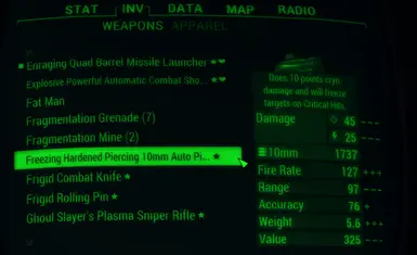
It's not like F4 is any better, they put those ridiculously small text boxes in PipBoy, so if you upgrade something you can't see what it is. As you see only "superior reinforced amaz" and text is cut as it is longer than text field.
Comment has been collapsed.
Please tell famous games which have bad interfaces (and say why).
How could the developer have improved that interface?
You can show if you want it. It can be any game (PC or non-PC game), from any generation.
GA1
GA2
+Fast giveaway
Comment has been collapsed.